Adaptive is useful for retrofitting an existing site in order to make it more suitable for mobile phones. This allows you to take control of the design and web development for specific, multiple viewports. The number of viewports that you choose to design for is entirely up to you, your company, and your overall budget. It does, however, afford you a certain amount of control (for example over content and layout) that you won’t necessarily have using responsive design.
Responsive Web Design (RWD)
Definition
Responsive web design is an approach to web design that makes web pages render well on a variety of devices and window or screen sizes.
Key Features
- Flexible Grids: Use of flexible grids to create a layout that can adapt to different screen sizes.
- Flexible Images: Images are sized in relative units, ensuring they adapt to the screen size without distortion.
- Media Queries: CSS media queries are used to apply different styles for different devices or screen sizes.
Advantages
- Improved User Experience: Users can access content on any device without loss of functionality or aesthetics.
- Cost-Effective: Maintaining a single codebase for multiple devices is more efficient than creating separate websites or apps.
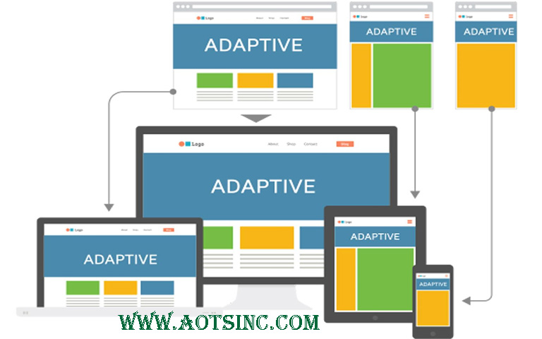
Adaptive Web Design
Definition
Adaptive web design is an approach where the design and layout of a website adapt to the characteristics of the user’s device.
Key Features
- Different Layouts: Instead of a single flexible layout, adaptive design involves creating several layouts for various device categories.
- Server-Side Components: The server detects the type of device and sends the appropriate layout to the user’s browser.
- Progressive Enhancement: Enhancing the user experience by progressively adding features based on the capabilities of the user’s device.
Advantages
- More Control: Designers have more control over the user experience on different devices.
- Performance Optimization: Tailoring content and features based on the device can improve performance.
In practice, these terms are often used interchangeably, and the boundaries between them can blur. Both approaches aim to provide a seamless user experience across different devices. Choosing between responsive and adaptive design often depends on the specific goals and requirements of a project.[https://aotsinc.com/blog/]